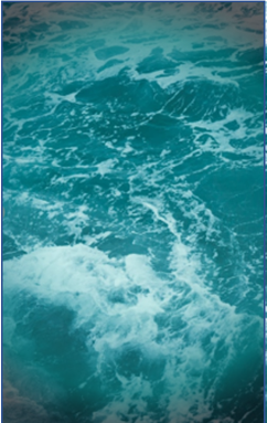
Here’s what we have so far. In my previous blog post, Designing My Own Book Cover: The cheap, basic process I used to make a decent cover for my self-published book – Michael Crowl – Author (mikecrowl.com), I detailed my very basic method for creating the background image for the cover of the books in my UNDERCURRENT series. I’m working on the cover for RAGING TORRENT, the third book in the series. There are similarities between the three books, and the cover process is basically the same for all three books—as it should be. Besides the title and the gold emblem/artwork that I use on each cover, I altered the filter color just a bit for each one. For UNDERCURRENT, like the image below, the filter is blue. For RISE OF THE WAVE, that filter is a bit more green. And for RAGING TORRENT, I plan a purple color. Trust me though… same process.
Since we worked so hard on this sample cover, let’s continue by adding text elements to this piece. Next up is the text of the titles, subtitles, taglines, plus the all-important author’s name. For my books, I wanted interest in that text, so I used two different fonts—Calibri for the header text and the subtitle (The series name), and a font called Immortal that I used for the main title and the author’s name at the bottom. For my title, I wanted something just a little bit different than the standard stuff that comes in Word. I picked one that looked different enough, was not too wild or crazy, and was still legible.
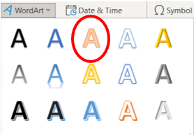
But before we get to the title, let’s practice with an easier one—the tagline. For UNDERCURRENT, my tagline reads, “If those in peril cannot reach for help, the help must reach for them.” But I can’t just stick that on the cover. To make it more interesting and more flexible, I’m going to use Word Art. In Word, go to “Insert” and the look for the Word Art button. You’ll get a menu like this one. I’m going to pick the third A (The middle one in the top row), because it’s a simple fill with an outline, and has no shadow and no glow. Click this one, and you’ll get a text box. Just type whatever you want in that box. It will be large!
I’m planning to use white text, but for now I’m going to leave the text orange so I can see what I’m doing. First, I’ll change the font to 16 pt. to be more manageable. It’s already Calibri, and I’m fine with that. I want to be able to reshape this text though, so I need to do a conversion.

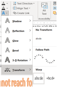
Once I have the text as it is above, I need to “transform” it so the shape of the text will change if I change the shape of the text box. Easy-peasy! Put the cursor in your text somewhere, and then click “Shape Format.” Directly below that button, click that blue, glowing “A” (which is the “Text Effects” button), and then slide down to “Transform”, and then click on that first “abcde” under Warp. This is basically a straight line, but it will convert your text so you can manipulate it. Now when you click your text box, you can stretch it all out and the text will follow! (To a degree.) I changed my text to 10 pt. font, and that allowed me to adjust the size to what I need.

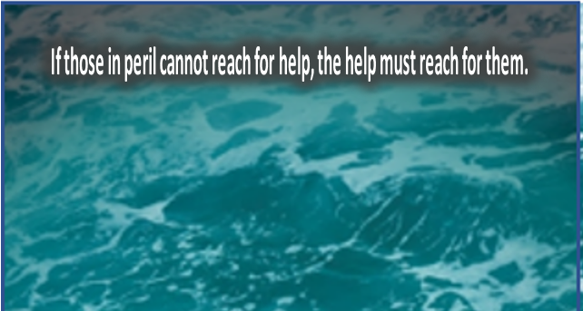
*The Key: You need to adjust the font size, and maybe even the word count, until you can get all the text you want inside the box, legible, and presentable. Something like this:
Between font size and transforming the text to an image, you should be able to make this fit in the space you need. Go ahead and play around with this a little bit.
The next step is to change the color. I want this text to be white, because I think it will show up best on the somewhat dark colors of the background image on the cover. I’m going to use the “Glow” function to make those letters stand out even more. Highlight the text, and then go to the “Home” tab of the toolbar and click the glowing “A” (Text Effects and Typography). You can change the Outline (No Outline) and the Glow (I chose black with a size of 14 pts and a transparency of 10%, but you may want a different color, size, or transparency). Mine looks like this:

So if we put it all together…
Do you like it? If not, just change things up until you do. Change the color, use a different font, take the glow away, whatever. This is what’s fun about doing your own cover.
So, finish adding all the rest of the text to your cover, however you like it, and whatever looks good to you. If you decide to do your own cover, though, treat this like your manuscript. You’ve probably sent your manuscript through several readers, critique partners, maybe editors, friends, and family. You should do this with your cover too. The quality of your cover should match the quality of your book. I seek feedback first from my family, and luckily, they like to share their opinions! The title is too high. I don’t like the yellow text. The background is too dark. Whatever. Listen to this, because people do judge a book by its cover!
Next time, expect a little bit about my dabbling in the graphic arts as I attempt a small piece of artwork to adorn my cover. I experiment with a new drawing tablet, and in true Mike Crowl fashion, I’m going to use software that I already have (and that you probably have too).
